
Sports
Which Major Sports Teams Are Most In Need of a Revamp?
Welcome to the weekend. As you may know, before I started writing for this site*, I worked at a grocery store to pay the bills while I was in college. Often, I would work a closing shift (at this particular store, 3 PM to 11 PM) with a handful of other people roughly my age. […]


Welcome to the weekend. As you may know, before I started writing for this site*, I worked at a grocery store to pay the bills while I was in college. Often, I would work a closing shift (at this particular store, 3 PM to 11 PM) with a handful of other people roughly my age. The place would be dead after 8:30 or 9, especially on a weeknight. This gave us lots of free time to discuss many, many things. I do remember one conversation I had with some of my coworkers on one of those nights, about what our least favorite sports uniforms were.
This was in 2015 or 2016. Three of the teams we talked about still haven’t changed.

Leaving aside their identity crisis in the mid-2000s (they are, officially, the Los Angeles Angels — no more “of Anaheim” suffix), the Angels have been pretty much unchanged since dropping their Disney uniforms ahead of the 2002 season. And while they instantly won their first World Series in the new threads (and were pretty competitive for the remainder of the 2000s), it is now more than time for the Angels to ditch the red. It has never made sense to me that a team called “the Angels” wore red, a color traditionally associated with the devil and demons. Let’s get some golds and blues up in here, some really heavenly shit.
I’ve never liked the wordmark — it’s always felt off-center and unbalanced to me. I’ve also never liked their sleeve patch. It’s just their cap logo, on the sleeve. It was extremely annoying when the Angels had both the roundel-A and cap logo sleeve patch, but then they kept the worse one when they added the ad patch!
Also: put the location name on the road jersey. I don’t care whether it’s Anaheim or Los Angeles or even California. Just please put it on the road jersey. Few things annoy me more in baseball, especially when the Angels’ wordmark is as weak as it is.
I’ve made no secret my disdain for the Mavericks’ unis (see this piece from after the NBA trade deadline), but it is kind of mindblowing to me that the team has been virtually unchanged since 2001, Mark Cuban’s first full season owning the team. Think about how long ago 2001 actually was. Everyone had a 70-pound CRT TV. AIM was the height of social media. Cell phones looked like this. Bill Clinton was still president for the first three weeks of that year!
It makes sense that Cuban, who became one of the very first tech billionaires, pivoted the Mavericks away from their previous identity towards the Y2K aesthetic, which was omnipresent at the time. What doesn’t make sense is that it’s stuck around for a quarter-century, long after the aesthetic faded into obscurity.
The fact that the Mavs have retained these for so long astounds me. They weren’t particularly good in 2001, and they’re extremely dated now. I would love to see the Mavs reorient their identity around this year’s City Editions, which have a more Dallas-y feel, in addition to being unlike any other primary look in the NBA.

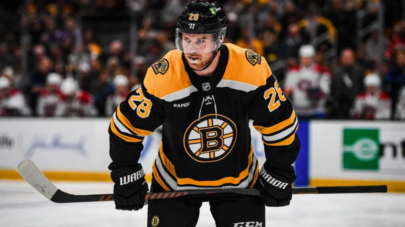
Perhaps my most controversial pick for this piece. The Bruins first adopted this look back in 2007 (time flies) after a decade wearing what fans now call the Joe Thornton-era unis.
The adoption of this set marked a turning point in Bruins history. The offseason before, the Bruins used their vacant cap space from the Thornton trade to add towering defenseman Zdeno Chara and forward Marc Savard. With the emergence of youngsters Patrice Bergeron, Brad Marchand, and David Krejci, the Bruins became one of the best teams in the NHL in the 2010s.
But now it’s 2025. Chara, Krejci, and Bergeron are retired. Savard’s been retired for over a decade following concussion issues. Marchand has been traded for one last Cup run. The Bruins are on a ten-game losing streak at the time of writing.
Like the team, the unis are starting to creak. The logo, which at the time seemed fresh and clean, now feels a bit busy. The shoulder yokes, which once felt retro, now just feel dated. The Bruins also dropped yellow socks for black in 2017, which downgraded the look of the home uni. When the team adopted their centennial season unis in 2023, it really brought to light just how much better the Bruins could look.
Now, the B’s are all but confirmed to be dropping these unis at the end of the season, and (if the leak is to be believed) will be addressing basically all of my concerns. Like in 2007, it seems to be the perfect time to say goodbye and usher in a new era of Bruins hockey with a new uniform. Let’s just hope they have yellow socks.
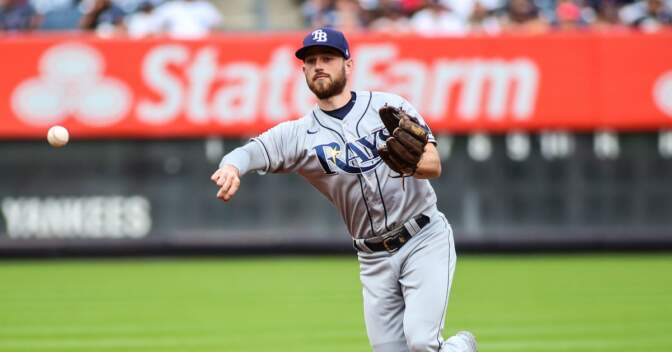
Moving from a team whose current look was adopted in 2007 to a team whose current look was adopted in 2008, the Tampa Bay baseball team has now spent nearly twice as long as the “Rays” than they ever did as the “Devil Rays.” One of the first critiques I ever remember hearing about the Rays’ look was that they went from looking like a professional baseball team to looking like a Florida retirement home’s baseball team, and that still feels right today.
There’s widespread nostalgia for the (Devil) Rays’ original, 90s-tastic look, but I was always partial to their second look, which they started wearing after only three seasons with their first identity. I feel like they could go back to this with minimal changes and instantly be one of the better-looking teams in MLB, instead of one of the most forgettable.
Also: neither MLB team I’ve chosen for this list has their location on their road jersey. I wasn’t thinking about that when I chose them (both the Angels and Rays were chosen because their looks are boring and forgettable and were adopted when I was a kid, and now I’m 30), but now I feel like I have to point it out.
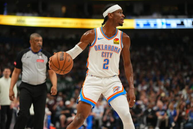
The Thunder’s identity has always felt like a placeholder that everyone kind of forgot was a placeholder. There is nothing about the Thunder’s colorway, fonts, or logos that actually evokes “Thunder.” Where are the menacing deep greys and purples, like the sky during a thunderstorm? Where are the lightning bolts?
Don’t even get me started on this logo. It looks like clip art, and could be used for a basketball team called literally anything as long as they called Oklahoma City home. Back in 2015, the incomparable Zach Lowe ranked all 30 NBA team logos for Grantland. The Thunder were last. He spoke with designer Dick Sakahara, who worked with the Thunder on their identity, who told him that he had “a lot of bison [designs] that never got to be.” How cool would a bison logo be for Oklahoma’s only pro sports team? Lowe also spoke with Brian Byrnes, then the Thunder’s senior vice president for marketing and sales, who told Lowe “We didn’t feel like having professional players represented by [an] animal was where we wanted to be.” Someone should remind Byrnes of the Lions, Tigers, Eagles, Bulls, Cubs, Grizzlies, Cardinals, Bears…you get the idea.
The Thunder could be really cool. Instead, they’re really not.
*I also worked at a grocery store for many years while still writing for this site, but that’s neither here nor there.


Sports
Student-Athletes Excel in Classroom During 2024-25 Academic Year
Story Links ARLINGTON, Texas – As UT Arlington student-athletes achieved championship success in competition, the foundation was laid in the classroom. As a collective, UT Arlington student-athletes combined for a 3.130 grade point average in the Spring 2025 semester. Of the 11 athletics units, eight teams earned at least a 2.9 GPA […]

ARLINGTON, Texas – As UT Arlington student-athletes achieved championship success in competition, the foundation was laid in the classroom.
As a collective, UT Arlington student-athletes combined for a 3.130 grade point average in the Spring 2025 semester. Of the 11 athletics units, eight teams earned at least a 2.9 GPA during Spring 2025, led by women’s tennis with a 3.530 GPA, just ahead of men’s tennis with a 3.454 GPA.
Those teams were followed by women’s golf (3.450), volleyball (3.188), women’s track & field (3.159), women’s basketball (2.969), men’s golf (2.941), men’s track & field (2.930).
For the 2024-25 academic year, UT Arlington student-athletes combined for a 3.135 grade point average, with 39 students earning degrees. This is the 23rd semester in a row that the athletic department held a cumulative department GPA above a 3.0. Combining the fall and spring classroom performances, all 11 teams attained at least a 2.8 GPA.
2024-25 Cumulative Grade Point Averages
| Women’s Tennis | 3.519 |
| Men’s Tennis | 3.500 |
| Women’s Golf | 3.469 |
| Volleyball | 3.298 |
| Women’s Track & Field | 3.127 |
| Women’s Basketball | 3.037 |
| Men’s Basketball | 2.989 |
| Softball | 2.914 |
| Baseball | 2.902 |
| Men’s Track & Field | 2.877 |
| Men’s Golf | 2.849 |
FOLLOW THE MAVS SOCIALLY
For up-to-date news, photos and videos, follow the UTA Division of Intercollegiate Athletics online at UTAMavs.com or via several social media accounts on X @UTAMavs, Instagram @UTAMavs and Facebook /UTAMavs.
Sports
Hailey White – Assistant Volleyball Coach – Staff Directory
Hailey White joined the Western Colorado volleyball coaching staff in June 2025. White enjoyed a successful four-year collegiate volleyball career, competing at NCAA Division II Central State (Ohio) University, Glendale Community College, and Benedictine University (Mesa). She was an integral part of the Redhawks’ offense and defense as a middle blocker in Benedictine’s 2023 California […]
White enjoyed a successful four-year collegiate volleyball career, competing at NCAA Division II Central State (Ohio) University, Glendale Community College, and Benedictine University (Mesa). She was an integral part of the Redhawks’ offense and defense as a middle blocker in Benedictine’s 2023 California Pacific Conference tournament championship. Her athletic excellence was recognized with Second Team All-Conference honors during both her freshman and senior seasons. In her final year at Benedictine she earned AVCA Southwest Region Honorable Mention recognition, highlighting her impact at the highest levels of collegiate competition.
Beyond her on-court achievements, White demonstrated exceptional character and leadership, serving as a team captain, and earning the prestigious Champion of Character Award during both her junior and senior years. This recognition reflects her commitment to exemplifying the values of sportsmanship, integrity, and leadership both on and off the court.
White maintained academic excellence throughout her collegiate career and was recognized with the Dean’s List honor during her junior year. She recently completed her Bachelor of Arts degree in psychology with a minor in criminology from Benedictine in Mesa, Arizona.
White brings valuable coaching experience from her two-year tenure with East Valley Juniors, where she served in both assistant and head coaching roles from 2022 to 2024.
Her coaching philosophy centers on cultivating competitive teams through individual skill development, fostering team cohesion, and instilling core values of sportsmanship, discipline, and teamwork.
Sports
Long Beach Century Club Announces 2024 Hall Of Fame Class – The562.org
The Long Beach Century Club will host its 68th Annual Sports Banquet on June 16 at The Grand in Long Beach, recognizing the city’s top high school athletes along with a host of special award winners including a new class of Hall of Fame inductees. This year, the Century Club is inducting four new members […]
The Long Beach Century Club will host its 68th Annual Sports Banquet on June 16 at The Grand in Long Beach, recognizing the city’s top high school athletes along with a host of special award winners including a new class of Hall of Fame inductees.
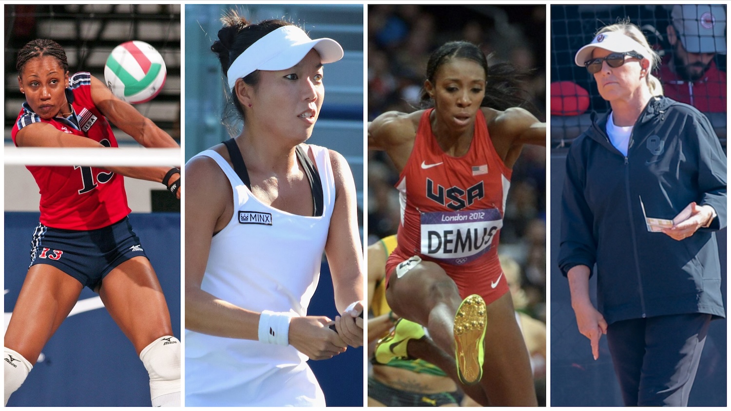
This year, the Century Club is inducting four new members into its Hall of Fame: Long Beach State volleyball legend Tara Cross-Battle; Wimbledon and US Open doubles champion and Long Beach Poly alumna Vania King; Olympic gold medalist and former Wilson track star Lashinda Demus; and Oklahoma softball coach and Long Beach State alumna Patty Gasso.
Cross-Battle led Long Beach State to an NCAA title in 1989 and was named AVCA Player of the Year in both 1988 and 1989. She won the 1990 Honda Sports Award as the nation’s top collegiate volleyball player and was a four-time All-American. Cross-Battle earned an Olympic bronze medal in 1992 and was later inducted into the Long Beach State Hall of Fame (1995) and the International Volleyball Hall of Fame (2014).
King was a top-10 doubles player during her professional tennis career, winning both the Wimbledon and US Open women’s doubles titles in 2010 with partner Yaroslava Shvedova. The pair also reached the final of the 2011 US Open, and King went on to win 15 doubles titles on the WTA Tour. King also won a singles WTA Tour title at the 2006 Bangkok Open.
Demus set multiple state and national records during her time at Wilson High School, where she was also named Track & Field News’ National Girls’ High School Athlete of the Year in both 1999 and 2001. She went on to compete for the University of South Carolina before winning multiple world titles and an Olympic gold in the 400-meter hurdles in 2012—becoming the first American woman to win the event.
Gasso played softball at Long Beach State from 1983 to 1984 and began her coaching career at Long Beach City College in 1990. She was hired as the head coach of Oklahoma softball in 1995, where she just wrapped up her 31st year with the program. She has led the Sooners to eight national championships and holds the record for most wins by a coach in program history.
“This is really, honestly, my real home,” Gasso said of Long Beach. “So to be remembered and honored by those here means a lot to me. It grabs my heart strings really hard because I miss it here. I’ve lived 31 years in Oklahoma, but I still know where I came from, and that’s the Beach.”
The Century Club will also recognize its Athletes of the Year at the banquet, including four Long Beach natives who helped the USA men’s water polo team win a bronze medal at the 2024 Paris Olympic Games: Max Irving, Chase Dodd, Ryder Dodd, and Hannes Daube.
Irving, a Wilson alum and two-time Olympian, was one of the team’s top leaders. The Dodd brothers grew up in Long Beach but attended high school in Orange County, with Ryder becoming the youngest member of the USA team since Long Beach legend Tony Azevedo. Daube also grew up in Long Beach and lists it as his hometown, though he attended high school in Orange County.
The Long Beach Century Club’s 68th Annual Sports Banquet will be held on June 16 at The Grand, located at 4101 E Willow St. in Long Beach. Reception will be at 5 p.m. and dinner and program at 6:30.
Sports
How to Watch League Week 2 – San Diego: Stream AVP Beach Volleyball Live, TV Channel
Week 2 of the AVP Beach Volleyball season heads to San Diego, California with the best professional players in the world. The best professional beach volleyball players in the world head to the home turf of the defending AVP Beach Volleyball champions for week two of the 2025 season. The San Diego Smash host this […]

Week 2 of the AVP Beach Volleyball season heads to San Diego, California with the best professional players in the world.
The best professional beach volleyball players in the world head to the home turf of the defending AVP Beach Volleyball champions for week two of the 2025 season. The San Diego Smash host this week from the Viejas Arena on the San Diego State University Campus. This two-day event showcases four teams including San Diego as the host team playing matches across two days of play. The first day has a slate with the men and women from each team playing against each other. Here on the first day the LA Launch take on the Dallas Dream to get the action started. San Diego takes on the Austin Aces.
How to Watch League Week 2 – San Diego today:
Game Date: Friday, June 6, 2025
Game Time: 9:00 p.m. ET
TV: CBSSN
Live stream League Week 2 – San Diego on Fubo: Start with your free trial today!
Sports
UEFA Champions League, soccer properties drive CBS Sports digital growth
Despite a 5-0 blowout in the UEFA Champions League final between PSG and Inter Milan last Saturday, CBS Sports has seen growth in its digital presence driven by soccer properties since boosting its presence in the sport. “It was a culmination of a really successful season for us,” said Jeff Gerttula, EVP & Head of […]
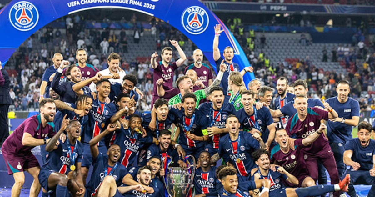
Despite a 5-0 blowout in the UEFA Champions League final between PSG and Inter Milan last Saturday, CBS Sports has seen growth in its digital presence driven by soccer properties since boosting its presence in the sport.
“It was a culmination of a really successful season for us,” said Jeff Gerttula, EVP & Head of CBS Sports Digital.
“Soccer is a really interesting property for us, probably because it best represents new sports and where we’re investing and growing in the way that we’re approaching sports,” Gerttula said. “Soccer is something we’ve really jumped into the last five years. We didn’t have any soccer presence, and now I think it’s safe to say we’re a global leader in the space.”
According to Gerttula, Champions League has become a “massive new vertical” for CBS Sports, with an approach built around streaming and social.
“We’ve had a lot of success with soccer generally as a vertical on Paramount+,” said Gerttula, pointing to Champions League, Serie A, NWSL, Concacaf and EFL.
CBS entered the soccer space in 2020, taking over the final year of TNT Sports’ Champions League media deal. “We went from zero to everything — it was very strategic,” Gerttula said. “We identified the sport as a place for us to invest in as part of our sports strategy with Paramount+. We had to really invest in it and authentic content for these audiences, we felt like they were underserved.”
“What we’ve also done is surrounded that with the programming strategy that’s very social centric,” Gerttula said. “We think of it very much as a streaming and social unified production model. We’re going after younger audiences. It’s so core to us to be able to speak to soccer fans on multiple platforms.”
CBS Sports Golazo Network, a free streaming platform, grew 83% year-over-year in minutes watched, and CBS Sports HQ has seen a 9% increase in minutes watched.
“It’s allowed us to reach soccer fans on free streaming platforms and engage soccer fans who are in Paramount+ more,” Gerttula said. “All of that plays with the social mindset in terms of the talent we hire, the topics we cover, how we cover them and the way that we produce the shows.”
From the start of Champions League in September, the Golazo social platforms generated more than 4 billion views for the second consecutive season, culminating at 4.6 billion total views. Saturday was the second most-streamed day ever for Golazo, behind a day in August 2023 when it had Lionel Messi’s first freely available match after he joined MLS.
Overall, CBS Sports has increased total engagement on social platforms 24% year to date in 2025, despite not having the the Super Bowl this year (unlike in 2024).
In its seventh year, CBS Sports HQ is up 69% in YTD impressions, and has recently been on-site at the Super Bowl, men’s and women’s Final Four, Masters, CFP national title game, World Series, and will be at the Women’s College World Series this month.
Gerttula still sees “massive growth” potential for soccer, and identified women’s sports as a heavy focus, particularly the NWSL and WNBA. “We’re going to be aggressively integrating that within our stream ecosystem, with HQ, and really thinking about it in a more authentic way,” Gerttula said.
Coming up, CBS Sports is turning its digital attention to the NWSL, U.S. Open Cup, UWCL, USL, UEFA Supercup, EFL and Serie A.
Sports
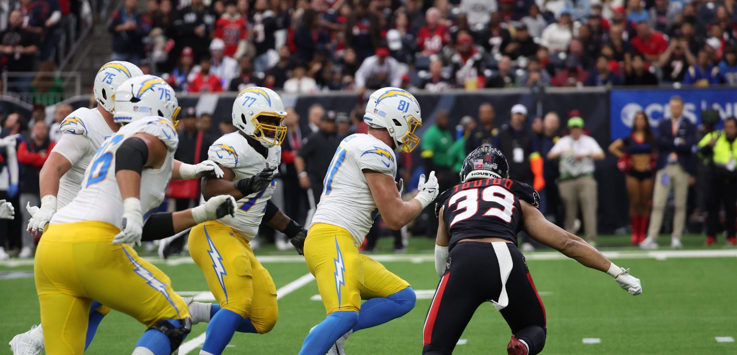
Will Dissly Transforms NFL Career with Bold Volleyball Move
Will Dissly’s Dual-Sport Aspirations In the competitive world of professional sports, athletes often seek unique methods to enhance their performance and longevity. Will Dissly, the tight end for the Los Angeles Chargers, is no exception. After navigating through a challenging season marked by a shoulder injury, Dissly is not only on a path to recovery […]
Will Dissly’s Dual-Sport Aspirations
In the competitive world of professional sports, athletes often seek unique methods to enhance their performance and longevity. Will Dissly, the tight end for the Los Angeles Chargers, is no exception. After navigating through a challenging season marked by a shoulder injury, Dissly is not only on a path to recovery but also on a quest to broaden his athletic horizons.
Embracing New Challenges
Dissly’s venture into beach volleyball under the guidance of former NBA player and Olympic beach volleyball competitor Chase Budinger is particularly noteworthy. This unusual crossover isn’t just a casual pastime; it represents a significant step in Dissly’s athletic development. Beach volleyball demands agility, quick reflexes, and explosive power, qualities that are beneficial on the football field, especially for a tight end required to block with force and catch with finesse.
Chase Budinger, whose athletic journey took him from the basketball courts of the NBA to the sandy arenas of Olympic beach volleyball, serves as an inspiring mentor. Budinger’s transition is not just about changing sports but adapting and excelling in a new athletic environment. His experience in high-stakes competitions, like the 2024 Summer Olympics in Paris and his notable second-place finish in the 2012 NBA dunk contest, provides Dissly with a blueprint for success in dual sports.
Impact on Football Performance
Integrating beach volleyball into his training regimen could give Dissly a unique edge in the NFL. The sport’s emphasis on lower body strength and balance can enhance his stability and tackle-breaking ability, crucial for a tight end. Moreover, the hand-eye coordination required in volleyball can translate into better catching skills in football.
Looking Ahead
As Dissly embraces this new challenge, his journey echoes a broader trend of athletes exploring sports outside their professional realms to improve their primary game. Whether this cross-training in beach volleyball will translate into enhanced on-field performance remains to be seen. However, Dissly’s openness to unconventional training methods and his determination to leverage them to maintain his starting role speaks volumes about his dedication and adaptability.
A Broader Perspective
The story of Will Dissly is more than just about sports training; it’s about resilience, adaptation, and the relentless pursuit of excellence. As he prepares for the upcoming seasons, his journey will be one to watch, offering insights into the potential benefits of integrating diverse athletic disciplines into traditional sports training. Whether Dissly can mirror Budinger’s success in becoming proficient in a second sport will be a testament to the evolving nature of athleticism in the modern era.

Kiwanis Celebrates Youth Baseball and Scholarships at Ray Wilson Memorial Field | Sports

Kentucky Basketball reportedly derailed SEC’s plans to cap NIL spending per sport

NiJaree Canady signs another seven-figure NIL deal with Texas Tech, report says

Student-Athletes Excel in Classroom During 2024-25 Academic Year

Hailey White – Assistant Volleyball Coach – Staff Directory

Pac-12 media deal timing and quality comps to the ACC, Big 12

How Nija Canady, Texas Tech beat Texas in Game 2 of Women’s College World Series to force Game 3

Long Beach Century Club Announces 2024 Hall Of Fame Class – The562.org

Central Montana Motorsports Edition | News

How to watch 2025 NASCAR Michigan: Schedule, start time, TV channel for Firekeepers Casino 400

Phorm Energy joins Hendrick Motorsports in multi-year partnership – Speedway Digest

Dad’s coaching style leaves a lot to be desired

NiJaree Canady signs new NIL deal to return to Texas Tech softball

JACKRABBITS ADD DUO AHEAD OF 2025 SLATE

Texas Tech’s NiJaree Canady inks second million-dollar NIL deal amid 2025 Women’s College World Series run


 has always dreamed in Mercurial. Now his initials are on the boots.
The new Kyl…
has always dreamed in Mercurial. Now his initials are on the boots.
The new Kyl… Former South Carolina center Nick Pringle commits to Arkansas basketball, John Calipari
 Deputies investigating incident that caused panic at Pace youth sports complex
 This is poetry in motion.
 Appling County football to forfeit all 10 wins from 2024
-
 College Sports2 weeks ago
Portal Update – Basketball and Gymnastics Take Hits
-
College Sports3 weeks ago
Portal Update – Basketball and Gymnastics Take Hits
-
 Professional Sports2 weeks ago
Jon Jones answers UFC retirement speculation as fans accuse champion of 'holding the belt …
-

 Health3 weeks ago
BYU women's basketball guard injures ACL twice
-

 NIL2 weeks ago
2025 NCAA Softball Tournament Bracket: Women’s College World Series bracket, schedule set
-

 Youtube2 weeks ago
Xavier Legette taught Marty Smith his signature celly

-
 High School Sports2 weeks ago
Today in the MHSAA
-

 College Sports2 weeks ago
NCDC Commitment Profiles: Cyclones’ Martins Moving On to Saint Anselm College • USPHL
-
 College Sports3 weeks ago
IU basketball recruiting
-

 Health3 weeks ago
New training facility opens in Reading for athletes' mental and physical advancement